make a success story together?
MBU uses cookies to provide you with the best possible service!
MBU uses cookies to provide you with the best possible service!
make a success story together?

with  from Amsterdam
GroenlandKip is a large Dutch food producer that processes and packages chicken and poulterer products for (international) retailers. They had an existing brand with which they sold healthy chicken meals. However, this brand no longer met the new requirements. The brand did not radiate quality, craft and healthy food. They came to us with the question whether we could develop a new brand from scratch that would be repositioned in the market. Well, we can. And so we started working.
How can you make a new food brand radiate quality and craftsmanship based on the name alone? Quickly it became clear during our brainstorming sessions. Because we could only think of the boss in the kitchen: the chef. He guarantees the taste and quality and exudes craftsmanship. That is why we have chosen the name: ‘Chef’s Taste‘. A brand that has a meaningful name and for which we have incorporated the iconic approval of the chef in the logo. We created a completely new corporate identity around this idea.
‘Chef’s Taste’ means craftsmanship, quality and tasty food. A clear brand name that immediately shows what the brand stands for. Every conceivable meal fits under this name. In addition, the brand name is not only limited to the Dutch market, but is also easily scalable abroad. The word Chef is so recognizable and strong that you immediately associate it with gastronomic meals. The combination of Chef and Taste also radiates authority and craftsmanship.
![]()
The idea behind the logo is the classic chef with a high chef’s hat who tastes his dish, which has been worked on for hours with passion and eye for detail. Once the taste is perfect, the thumb and index finger are brought up to the mouth, followed by an approving kiss on the fingers: “Perfection”. This expression of approval and finesse is reflected in the logo. The fork symbolizes the food and the fingers the chef’s approval.
Coming up with a new logo and a new corporate identity is fun, but in the end it’s all about the products. Because the new style had to elaborated on that. So we designed different packaging.
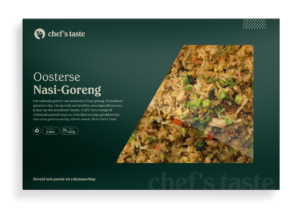
Designs have been made of buckets, large gastro trays for meals, product information stickers and also a catalogus has been developed in which all Chef’s Taste dishes are described. This catalog was distributed at the Horecava in the Rai Amsterdam.
Because when the new brand was completed and taken into production, Chef’s Taste presented itself at the Horecava in the RAI Amsterdam. At the largest catering fair in the Netherlands they had their own exhibition stand that needed to be decorated. For this we have designed the appearance: from the walls to the cups, and from the product name cards to the banners. Everything completely in the new corporate identity.
“After previous collaborations with MBU, we wanted to introduce a new product line. Together with the MBU team we came up with a fresh, modern but certainly also sales approach. We are very happy with the collaboration. The team works well and thinks in terms of solutions, not in restrictions. “
make a success story together?


